Thursday 29 March 2012

EVALUATION 7:Looking back at your preliminary task (the school magazine task), what do you feel you have learnt in the progression from it to full product?

EVaLUaTIoN Question

Throughout the process I have continued to learn from my preliminary task to create my final piece to represent my target audience as well as an actual music magazine.
Firstly the front pages show the changes that I have made through learning in Photoshop. The front cover of my music magazine it show how  have more effectively used the spacing of the page and aligning all the text accordingly well to the image.
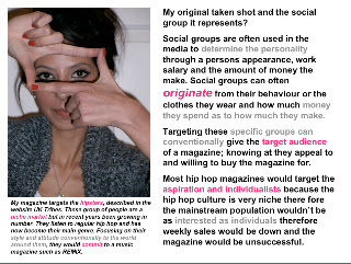
In my preliminary task the pictures text is put in places where it could interfere with the main image importance such as the girls head. the text says:
Sixth form inter-form sport results and fixtures! 
 At the time lineament wasn't something I was used to ass I often didn't know when it was necessary and needed to be corrected.The text were also spaced out oddly and sometimes became in close contact with another piece of text. However in my final piece the lineament had improved through the work of Photoshop and their tools, I was able to make my final piece front more spacious and using the plain background space effectively to grab my target audience. This was mainly attained thought the advertisement of the iconic artist concert ticket. The elliptical circle, created by Photoshop had text which said:
" A chance to see drake live in London!" 
 This would draw them in through the celebrity endorsement and showing that you know what artists they would want to see. This was not used at all in the preliminary task and there were no offers to the readers.

Secondly would have to be the amount of editing I did to the front cover image to make it more appealing to the target audience as well as any publishers who would be interested in selling the magazines.
In the preliminary task, my picture was not edited in brightness because we had a tight schedule and I wanted to get a good image. I further went on not to change anything at all which later affected the picture.

However in my final piece I constructed a lot of editing to make the picture high quality, along with making sure that it would be an appropriate shape, blemish free, bright colours slightly contrasted so make an colour block effect.
the remix title:
"REMIX, Change It Up"
Show this perfect as the two colours are bold, bright and are commonly used throughout the front page and the music magazine.
 This was incredibly important that this is done so that the colours used on the page through Photoshop would not drown out the colour from the original background photo. As you can see in the preliminary I did not and the cover looked odd and disorganised well as my final looked polished and bold.


Secondly, the contents page shows how I have developed my understanding of photoshop and other technologies through the layout of the page and the appropriate colour schemes. As well as this, I have learnt to use my resources more carefully to pick how many pages would be needed. Such as the amount of pages for the DPS and contents page are not fixed so if its better for the target audience and depending on whether the music magazine is weekly or monthly if the contents is a double page and the double page spread has an extra page.
In the preliminary task the contents pages was created through basic ideas and want I already knew about photoshop in that small amount of time.
the word:
"CONTENTS, contents"
was repeated because I wanted to combine two different fonts and colours to show the schools identity and house style. this was achieved through the colour indicator however the colour seemed to clash and there was different shades of the same colour so my contents eventually looked far from professional.
Titles such as:
"Sports News And, And In Other News"
did not show up well against the picture because the structure of the contents was bad. Furthermore I ended having to delete some information I was planning to put up there because I would not know how to display a DPS contents because of the amount of research we had done up until that point.

However in my final piece I had decided to firstly use a double page contents so that I could use a common convention of a monthly music magazine as well as include any of the information that may have been missed out such as the:
"The GRAMMY and BRIT nominations are in!"
I also decided to use a conventional editorial letter so that the audience would feel a connection or a friendship between the magazine and the reader.
The colour scheme was accurate as I used the colour indicator so that tit gave it a professional look. I also used the same colours that can be found in the title. I also tried to stick to the monogamous colour scheme and made the background black.
I added the title:
"THIS WEEK"
  To stick to the common uses of a Hip Hop magazine to inform the readers of the latest goings on of the hip hop world as well as news such as awards and festivals.
I also decided to display the word contents in a different way, similar to what I tried to do in the preliminary task.

Within my first attempt the image was placed on the left hand side, and because I did not put a different layer when it was created it limited the movements on the page and I could not make any improvements.
The contents had overall improved because of the new techniques that I had picked up and the through research on my target audience which were not thought though properly in my preliminary. 


EVALUATION 6: What have you learnt about technologies from the process of constructing this product?

EVaLUaTIoN Question 6

This image shows how Photoshop allowed me to
compare fonts for my front cover. 


The clear guidelines helped me gain accurate
columns.

And it allowed me have a separate page for an image
without it being complicated


Tuesday 20 March 2012

EVALUATION 5: How did you attract/address your audience?


In order to find out what my audience was looking for I decided to interview two people from my target audience to see what they look for in a Hip Hop magazine.
Both them seemed to agree on the same things and they seemed to give a positive outlook on REMIX magazine as the front page often targeted the right females and even some males.
I then decided to start some flat packs so that we can see some appropriate layouts before starting the project. I felt that this helped because I was able to look at the different dimensions as well as think ahead to colour schemes and cover artists.

These Flat Packs drawn shows the different layout and examples of existing Hip Hop magazines layout would help me attract my Target Audience more successfully.
My second contents page

My first contents poage

M front cover (ORIGINAL)

XXL example flat pack

Rap Up example flat pack


I also appealed the the ghetto nature by the pose my protagonist did
My pose enhances the readers curiosity
XXL magazine does the same, mainly injecting fear through the
angry look and fingers leading to it.

Friday 9 March 2012

Double Page Spread Construction

THE Construction
The Construction Of My DPS Page
To begin my DPS page i had to make sure that I had an image that was very bold and said a statement about my artists music.

Firstly I obtained an image of my protagonists in a particular position, touching the wall.I decided to play off this position as it gave me an opportunity to add things that weren't necessarily there. That is what gave me the idea for giving her a background of posters of former and currant Hip Hop artists.


Firstly I replicated the page and started place images of the artists and compress them to make a collage. This was done by creating new layers and compressing the image to create a background layer without affecting the quality of the picture.
 This turned out very successful as it gave me a bold edge to work with I wouldn't have to add any other designs to the image.The addition of pop colour provided by the cover of the XXL magazine allowed me to synchronize with the red when I wanted to use this as the quotes and title colour. I then used the untouched original image and used a large eraser tool to create a fading effect as well as fading the edges and then it the faded picture over the collage the create  her presence as well as her being in the beige background.

This turned out incredibly successful and the effect went according to plan, it also allowed me to show a convention of a hip hop magazine by having similar and legendary artists which the new artists to look up to.
I then went on to create the second half of my page. This mainly consisted of the text as I already had an image dominated page. I firstly put the interview text into three columns; making the questions and answers identifiable by the boldness and type of font.
Types of font used:

  • Cartoonist SF
  • Arial
Unfortunately, I found out that I wasn't allowed to use images from the internet so I decided to make a new background image from scratch. Firstly, I used this image.

I went into photo shop and used the patch tool to get rid of the wispy hair in the way of her face and the baby hairs that looked out of place. I then used to copy tool to make sure that the skin was clear all over before used the brightness/contrast tool and bring her skin to life as well as fit in with the quality of the images used during my final product.
I then decided to crop my image so that we could fit in the the double page but then when putting in In-design, the image came out shorter than what I needed.

I then added another layer, creating a quote  by changing the colour of the text and adding a different font. This was carried through as it was used for the title of the artist and the introduction strap line. I then added yet another layer as I wanted to figure out a way to put a larger letter rather than the original increased font size. So I decided to add a thick  big letter A for along and add editing. Firstly I had to Aline the letter with the whole page so that the A would be an even size.

It was then followed by adding the transparency tool and applying it to the letter, further I added it to the back so that there was no chance that text would be left behind. This effect is used as a convention in music magazines but usually as a block colour. I feel that I have successfully reinforced and challenged the stereotypes of a hip hop magazine.   


All that was left of my music magazine was to figure out the fonts colour scheme that would go well with the other pages such as the front cover and the double contents page. Firstly I tried the mint green that has a place in the contents page. I felt that this went well with the image but it failed to stand out on the white background. I then tried to make a colour scheme of this by adding the fuchsia pink coverline with a black strap line but it failed to come together.
 I felt that maybe I should try to link the colour scheme to existing colours on the page such as the red seen in the corner saying XXL. This then didn't work as it clashed with other parts of the page.
 This was my final colour scheme was when I went back to the beginning and look over the colour scheme. I eventually choose fuchsia pink, golden yellow and all the colours used in the original word remix on the contents.
 My final edit consisted of this after the background image change.
I added the different colour such as the mint green that existed in the front cover and contents page as well as adding a masthead, conventionally seen in most music magazine.


Contents page construction

My Contents Pages Constructions
My contents was eventually the hardest part of my final pieces as it took lots of different ideas to be put together to let the contents fit in with the house style and still look organized as a conventional contents page. I also had to have two contents pages as they 

My first idea was to make the background colour Grey so that it could allow the colours black and white, which are both part of my colour scheme. But when it came to adding the different texts it different come out clear and looked slightly cheap. Firstly I decided to clear up the pictures by adding brightness to them, making them look more professional.
The brightness tool was also to add colour to the dull looking background. The contrast was not used as much as it was for the front cover image because i needed them to be crisp and without the highlight pigments on their skin. I then used two images to create a box to put subscription information in.
The lineament was where i wanted to look different but in the end just looked boring and didn't fit in with my colour pop house style.  
As you can see i didn't get very far with the first idea as I could see
 that it wasn't going to be successful. The problems were mainly
occurred when the house couldn't be used a well was it was in the front cover
and the background colour became odd because of the colour of the texts and images.

After the first idea didn't work as well as i wanted i decided to make a new contents from scratch.
I started with new background colour to a lighter Grey so I could have a larger variety of colours.
Firstly I decided to add the same pictures, leaving them edited but them cropped the main image so that it would have a more landscape approach. I then added a new layer so that I could create an elliptical rectangle which later tilted, This was to make a bold page marker on my contents and add a conventional contents page feature. This was later was joined by another piece of text, which was a quote highlighting a bold statement made by the protagonist which the reader would find inside the feature.
"I'm grateful for what I've got, but I knew I would get it"
 Following this I decided to add the text at either side which would create two smaller columns to the largest column in the middle which would be used for the images such as the main image of my second protagonist.
For my text I decided to use font that would make certain highlighted areas known as well as sticking to the house style used on the front cover and the first contents page.
I then added some more layer and more elliptical rectangle that are tinted black, these are used to make the structure lines which are conventionally used in common music magazines. However this made my work look sloppy and unkempt so I decide later to reduce the size.
The feature of the album I created was made through layers of text onto the smaller cropped image and was tilted clockwise to create a realism. This was later added before making a separate J Peg image and adding it on the contents.
The REMIX magazine logo was used by having different colours for each letter in the font. The logo was also used to make the contents sign which was split up into groups for three lines. Remix was placed in between two of the line was to create a structural design which contributed to the identity of my product. 
This cover too was unsuccessful as it didn't look professional at all and it stood out  for all the wrong reason such as being too different from the house style.  

As the second design didn't turn out so well I decided to make a third attempt by adding more layer which had the rectangular shapes but in black and were enlarged to make a bolder platform for the text. I then added different text such as the "And the Grammy & Brit nomination are in!". The colour scheme was becoming more important as I had to fit the house style as well as maintaining a level of professionalism and displaying the conventions of a typical music magazine contents page.
Using the monochrome text and its contrasting background allowed us to bring the hip edge to the page but the Grey original background often clashed with the colours.The added images such as the Grammy award and the Brit were added using layers but these were too fake and disbelieving.
The third design didn't show much progress from the second and I felt like I needed to start from scratch if I was to get the successful contents page.
This is an image of a typical scan code,
placed on the far top right of the page.


Then came up with the common idea of adding the scanner which allowed people to interact with their magazine as well as bringing in the latest technology such as scanning with the iPod and iPhone.
These scans can give the readers insight into the magazines and the interaction that they might not get, even on the website. So I decided to use on my contents by adding synergy between the offer on the drake tickets with the scanning opportunity provided. This also allowed me to add a very modern convention of music magazine and showing the link to technology and the stereotypes of a Hip Hop music magazine. 


My final contents page turned out well due to the adjustment made from a new start.
First I started by getting rid of the old Grey background and getting a darker Grey colour which allowed me to do what I wanted with the monochrome and block, bright colours as well as give it the professional polish.
 I then added the extra layers and the elliptical rectangles to create the boxes, which were larger in contrast to the previous attempts. this allowed me to have more space to work with and having less room to contrast colours with both the text and the background.
The colour scheme came directly from the
front page and was used as a
 beacon by the dark colours. These colours were the fuchsia,
 lime sea foam green and burnt orange.
This is my FINAL edit.
This was followed by the texts in big and bold "This Week". This was a general convention shown in popular music magazines such as Q. I then decided to get rid of the broken down contents page title and put it in vertically and repeated. I thought that this would make great reference to my preliminary task as I used that technique for both the the title and contents.
The joint offer on Drake was then placed beside it to create three columns that may or may not be used.
The largest image was given its own background layer rectangle and took two of the three columns but later shortened to create room. I kept the image developed as it was but I got rid of the extra layer and box shape that it created for a neater, bolder page number, which jumped from the page. Another example of this is where I used the same technique for the page number of the Amber Rose story.
The artists index was given a smaller space besides the main image and a small but intense image.
I then used celebrity endorsement, often a convention of music magazines to create a album rating on the contents.
 In the first contents page I started by desaturating the image so that I could add the pop colour scheme. This was done by the brightness and saturation.
I then added the text by creting dfferent layers and synchornising the colours ith the previous page.
I then added an elliptical rectangle to join the house style of the previous page and added text, which on previous efforts I put on one page.
I think spreading it out over two pages was the best thing as I could out all designs forward without it looking rushed are less professional.
The fonts I used were:
CHI Town NF
Cooper Std
Base 02
Drive Thu NF

Thursday 8 March 2012

EVALUATION Question 4: Who would be your audience for your media product?

EVaLUaTIoN 4

My Target audience is strictly hip hop and Rn B lovers aged between 16-30.


However I wanted the magazine to be more female based because of the lack of attention female rappers and similar artists get on male hip hop magazines such as XXL and VIBE magazine.

I have previously go on to talk about my target audience and go into depth on the original hip hop and its evaluation to to the current hip hop we know today.
my blog link to my...
My target audience


This out of shoot photo shows the target audience in her nature.
the following images clearly display my stereotypical target audience for a female member.
Sabrina Carroll was the model I used as my main protagonist for my magazine as she had the look I was looking for.  

She is also a student so she shows the care and responsibility free side of a reader and would be more likely to commit to a magazine such as REMIX.

This graph displays the type of music that would be used by my target audience, categorized by UKTribes; the Hipsters.
They originated in the heart of East London as well as in Harlem, New York. This style has since spread all across the world.
It shows that we enjoy fashion labels that have a ghetto quirkiness and they like to be original.Once something has become mainstream, it is quickly dumped.
They were once called Nathan Barley's, after the nature of a character from a 1980s comedy.


However this graph shows another group that would be included and would be the majority of my target audience, categorized by UKTribes: Get Paid Crew.

They originated from the ghetto areas such a New york and Philadelphia and has now spread to south east London.

It shows you enjoy fashion labels and your proud to show it, for example you leave the sticker on to show a hat new as well as have new white trainers.You want to have an empire in something and would consider yourself as someone always on the ball.


This Video shows how UKTribes have detected Hipsters and Get Paid Crew
Click Here
This is an image of a group of my target audience shows their reaction to the way they see my magazine.


Monday 5 March 2012

EVALUATION 3: What kind of media institution might distribute your product and why?

EVaLUaTIoN 3:

The magazine industry has grown to be extreme and there are both weekly and monthly battles to produce a biggest selling magazine. For a magazine to be targeted accurately and to be distributed to the target audience the magazine has to be sold through an experienced but suited publisher.
 Music magazines are usually sold under the same publisher as lifestyle and other niche audience magazines so that the company is shown to have diversity, however publisher do not attend to have too many as this could deter from conventions of one magazine and put too much in another.

For my music magazine I have considered two publishers:

IPC media

IPC MEDIA is one of the nations top magazines publishing household names such as NUTS and NME.
 IPC Media produces more than 60 different brands, with print reaching almost two thirds of UK women and 42% of UK, a huge total of 26 million, while their websites gain overall 20 million users every month.

The inspire is popularly a male division; selling magazine magazine that would appeal to men in both mass and niche markets. most of their magazine have a male centred focus and may not be the best for my magazine however this may give me the right gap in the publisher for the magazine to have its own conventions and would be solely focused on.
Woman's magazines in IPC Connect are all lifestyle and local fashion. their female impute to their company shows the stereotypical impute of a female and doesn't seem to challenge the conventions in any way.
This might be a hindrance to REMIX because they might not see the vision for the magazine as making an impact to the female niche audience allow the magazine to show hip hop to its niche market and might turn the magazine mainstream in time.


IPC Media already publish two well known music magazines; NME and UNCUT.
NME is the most popular magazine for IPC media to publish. NME is a weekly magazine and the title stands for New Musical Express. this already introduces the type of music that may be introduced in the magazine. It may also be an indicator of the audience they want to attract; young people.


Bauer media

Bauer media is another international magazine publisher, producing magazines such as GRAZIA, heat and more! as well as music and film magazines such as Kerraing!, Mojo and Empire.

Upon this I have decided to make this my aimed publishers for my music magazine.


Bauer Media is a division of their multinational media group. It is europe’s largest privately owned publishing company. The group is a worldwide empire offering over 300 magazines in 15 countries, as well as online, TV and radio stations.

Bauer media is also popularly a male division; selling  major male magazines such as FHM and Q that would appeal to men in both mass and niche markets.

Bauer media attracts a 75% male to 25% female population (the male domination is through the increase in number in magazines moreover the late development of female targeted magazines). Most of their magazine have a male centred focus and may be the best for my magazine because it allows my target audience to be untouched and give me the right gap in the publishing company for the magazine to have its own conventions and would be solely focused on.


Woman's magazines in Bauer are mostly lifestyle but do contain popular high fashion magazines. Their female input to their company shows the stereotypical input of a female through their behaviour and even choice of music doesn't seem to challenge the conventions in any way.

This is perfect for REMIX magazine as it allows various magazines to collaborate with my music magazine with many benefits.firstly it would allow my magazine to be amalgamated with other female that may attract both mass and niche markets.

Both mass and niche market to the magazine through offers of free concert tickets and a discount on a fashion statement piece. Bauer owns more! and GRAZIA which would give REMIX a platform to break in to their target audience. Furthermore it would incorporate their individuality through breaking the stereotypical type of music that women listen to.

Synergy can also be created through the to media products of my magazine and the music radio channel. this would give me an opportunity to use many endorsement deals into their show and celebrity protagonists for further front covers for REMIX magazine.

as well as the fashion they peruse, we could
amalgamate together to create deal which would
improve the way people would see both magazines
as well as widen to mass market.


This would be perfect for REMIX because they might see the vision for the magazine within other music magazines such as Mojo and Kerrang! as making an impact to the female niche audience allow the magazine to show hip hop to its niche market. This would flourish because of its individuality, which can juxtapose to the many forms of media and the wide mass and niche market which my magazine could appeal to both.
click to see kerrang's niche website as to NME'S
mainstream one, targeted for the mass market


As you can see, my magazine among others fits well and looks as professional. It would also fit with Bauer media as many  examples of synergy can be used between REMIX and KISS radio.

Thursday 1 March 2012

EVALUATION 2:How does your media product represent particular social groups?

EVaLUaTIoN Question 2

I have decided to use more media terms for Question 2 like photo shop, You tube and PowerPoint in order to break down the different ways in which my front cover and contents fit the conventions of a stereotypical hip hop music magazine.

 Most groups are often known by the modern society and we now try to identify themclick here
My work against PAPER magazine.

Posture
A XXL example of posture and gesture. As you can see the rapper THE GAME is very body confident and strikes a pose directing to the eyes.


angle and shot type
An example by VIBE magazine of angle and shot type as well as lighting. the lighting is directed straight at his face to create more authority through the contrast on his face.


The paper magazine:

The PAPER magazine that I have used for comparison shows that I have used both the conventions of a hip hop music magazine through the processes needed to achieve an appropriate picture for my front cover.
The magzine shows a mid shot image of nicki minaj, against a clear white background.
She is seen making a gesture by holding her hair while her hand is in the clenched position. This can donnote wealth and power and her strong adjustment into fame. This is the intention I want to give to my readers when they see my front cover.
the text is clear around her , making her the centre of attention and adding to her sense of importance.