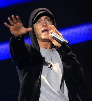
vibe magazine is a perfect example of the type of magazine i want to achieve in this task. the front cover of this issue i though was really inventive by putting to different covers against themselves in the same week. this shows friendly competition between the popularity of the artists and will engage the reader to pick and choose, urging them to buy the magazine rather than simply looking and leaving. the rem vibe shows the hip hop element without being too obvious of genre. the big block letters show the gangster image by being harsh and in your face. the title often contrasts with the background to bring a standout effect
the covers show two different artists that are put against each other so that the magazine can attract two groups of fans. this way they also create interest among hip hop lovers to evaluate their careers and gain interest in the included interview.
The Title:
the title are placed at the top and cover the full width of the page. the font is a very big, bold and in alternate bright colours; black and yellow. this house style continues throughout the magazine which creates a sense of familiarity and the use of being alternative. vibe magazine has a reputation for using the colour black as the prime house colour and is always used for either the title or the background. the big and bold nature shows it to be vibrant and very in your face, which always grabs attention. the colour alternate between the two magazines to show that it is the same issue but highlighting the different protagonists. the sans serif font shows a sense of informality but the title has a serious element by showing a milltary edge.
the cover: the strapline: in the both issues the strap line is slightly bigger than the title but not as bold, this allows it to gain attention from the shelves. in the drake issue they have used his t shirt to imprint the masthead. this is a creative way of using the black for effect and bring other things but the clothing to attention it says unstoppable. this shows the artists nature into his music and hes determination that may be revealed in his exclusive interview. In the Chris brown issue they have also used his clothing to promote the masthead which highlighted both the words and the clothing that he is wearing. the magazine shows an amazing way to bring simplicity to be effective. the masthead says R U Still Down? the rhetorical question is a clever way in bringing interest to the viewer and they think about what he may mean, urging them to buy the magazine. it may also show his nature by bring important information in his interview across and he may be referring to fans loyalty.
there are no other pictures on the page, this may suggest that they want the reader to focus on the protagnist and not to be distrarcted by possible sdverts or features which have nothing to do with music. the overall picture shows that the the magazine is very serous and might not be directed towards a younger generation but a serious music lover whow wants just the interview which is by their favourite artists.
For my magazine, i wanted a font that would show off the genre before it has even been opened. it needs to have a hip hop edge but still be bold and effectively eye catching. it is important to choose the right font in order to get the best results and use it effectively. i decided to go and use photo shop to check all the font that they could possibly have for the title of my magazine. here is some of the fonts i managed to come up with using photo shop.
I also decided to go onto the website called dafont to check on the internet to see if there were any better. I had decide to use the graffiti search because they can bring that hardness to face. I also think that graffiti would be appropriate as it is part of Hip Hop image. http://www.dafont.com/theme.php?cat=606 they have been put side by side to compare and show the different styles
Upon designing for my music magazine, i came up with a list of names that i wanted for for my magazine. i decided to put it up as a poll to let the public decide digitally. i thought that this was both a creative and convenient way to get information without bothering people with ticking questionnaires.
We Love POP! Magazine Analysis We Love Magazine is a monthly magazine which is released every four weeks. this can also be used for the magazine to be seasonal. it is created by the company EGMONT.
The I Love POP title connotes the type of music that would be in the magazine it is straight talking, but at the same time has a catchy title as the magazine has the pop genre. this normally attracts a mass market because of it popularity and the age group they attract, who are usually the pre teens. the bold, sans serif font shows that it illustrates fun and energy as well as informality. The title also captures it target audienceby putting it in a speech bubble to make it more childish and attractive to their ayes, the added colour and use of an emotion shows it young vibe.
There is also a motto underneath it saying "Don't bore us, get the chorus."
The Front Cover:
The Masthead/Title:
the masthead is placed in the top left hand side of the magazine so that it is the first thing you see when reading the magazine. it is in bold so that it stand out with the page and it usually leads the house style of the magazine. this is usually a bright child friendly colour so that it can catch a pre teen's eye for example jade green. again the sans serif font is used to show its informality to a younger generation.
Similar to We Love Pop magazine, sugar magazine has a very girly and child friendly title. it follows the similar tactics to incise young viewers, alternatively they have a boldbackground word rather than the cute text box.
The Strap line:
The strap line is slightly bigger font than the title and is also in lime green and keeping to the colour scheme. the strap line introduces the protagonist that would be featured in the magazine. this is placed right in the middle of the magazine so that it would draw attention to potential readers. it is also highlighted to make sure it is the second thing you read and it has a juxtaposition with the tag line and the background image. the strap lines also has a link to celebrity to bring any fans of the artist and an interview. below is a tag line which is in white and they link humor with a prop.
WHOA, ITS CHER! Little Miss Swagger Finally Snaps
the slantededge shows another attempt to give the magazine a young appearance, which fits perfectly with its ethos.
The Main Image:0
there is a medium close up of one celebrity protagonists, Cher Lloyd and a smaller image of the long shot of another celebrity protagonist, Pixie Lott who's in the bubble near the bottom of the page. the size of the a picture can often show how important something is in a magazine, this is true in this case as Cher is the main feature whereas Pixie is only a mere celeb example of a style feature in the magazine.
Cher Lloyd is the largest image on the page indicatingthat she is important to this issue. she is looking directly into the camera, holding a prop which is a camera showing a comical nature also shown by her facial expression. her body is tilted towards to the camera even she is sidewards on. her music is reflected by her tight blue top and the ghetto but cheesy chain of her name. she also has half her head shaved and the other curled to show her punk hip hop feel. she also displays a number of tattoos on her hands and fingers showing a tougher, more serious side.
Pixie Lott however is one of the smallest images on the cover and is seen on a full body long shot in an advert on fashion. they have focused on what she is wearing to show what we should be wearing and and buying. she is facing the camera and her body is full frontal forward. her pose and her cut, layered hair shows her pop rock music and reflects her punk attitude also shown in her pose.
overall the magazine has a a pop edgy vibe and wants to show off the different types of pop that they want the readers to know they also want to advertise to a wider, both niche and mass market so that there is something for most music lovers. they also want the opportunity to show pre teens to the world of music, and especially get them evolved with pop music.
other images on the page show posters of featured and currant artist, this might be an indication to the protagonists that may be in next issue. there is also a portraitof celeb showing what he might be talking about in his featured article. the house style of the magazine is pushed throughout the magazine and gives the sense of identity to the entire companies of publishers and editors.
Inside the Magazine: there are 66 pages and 10 of the are advertorial pages. these pages are to introduce new acts and to show the young readers of their personalities and a still image of a video they may have to draw them in. these pages may also have dates and adverts of gigs the artists may be doing in the upcomng festival and concerts around the country. on page 21 they have the double page spread on Cher Lloyd's interview the double page spread shows a film roll setupwith four portrait images placed inside. these are situated on the inside in between two columns. the text is colourcodedto show the difference between the question, answer and the most important bits, highlighted in bright yellow. another column is on the other page, which is next to a full body medium shot of her. to the left hand side the magazine has continued a comical slant by adding a quote in a pink circular text box. an advertorial of a competition is situated at the bottom of the page to win the prop, giving a reason for their young target audience to be more involved with the magazine and involves a link to a choice of media, the link to the website.
on page 2 and 3 shows a DPS which has an advert on the page based on dates for an artists tour and the contents. it is placed at the beginning of a magazine to catch the viewer while beginning to read the magazine early.
For my magazine i have decided to base it on the genre of
Hip Hop and Rn B. As i fan of this genre i feel that i can put more effort into this because of my interest and dedicate to the magazine. i also feel that there are not a lot of magazines that showcase this genre in the UK.
Hip Hop
hip hop music, also called hip hop or rap music is a genre that contains rhythmic music and base that it also joined with a rhythmic and rhyming speech, known world wide as rapping. this can sometimes be referred to as chanting. it had developed as a part of it native culture, which is divided into four sub genres:
MCing/rapping,
DJing/scratching,
Breaking/dancing,
and Graffiti writing, in recent times sampling and beatboxing are also included. as of recent times rapping has nowtaken over from a sub culture to almost what hip hop denotes. in most times hip hop is synonymously used in the term rapping mostly by the mainstream pop culture. however this is not the case as this is not a required component as some elements may just contain sounds such as beatboxing and instrumental. The Golden Age the hip hop golden age was known to be the time of mainstream hip hop between the 1980's and 1990's, this was because of it diversity and major influences. at this time there was strong links with Afrocentric and politics, while at the same time were experimental themes such as sampling. jazz was also a historic influence.
Ice Cube was one of the most famous pioneers of hip hop he rapped since the 80s. he began his career created new sounds and writing his own lyrics. He is still one of the influential people in the hip hop industry till today.
BET(Black, Entertainment, Television) bet was one of the first channels dedicated to black entertainment, which started on January 25th 1980 and has had its every own awards show since 2001.
Gangsta Rap and West Coat Hip Hop
gangsta rapis a sub genre of rap, famously known for theviolent lifestylethat reflect on the inner city black youths. the actual word gangsta is an informal pronunciation of the word gangster.
the main genre was pioneered in the 1980s by rappers such as Schooly D and Ice T, but was popularized in the mid 80s. By mid 90s rap had become the most lucrative area
of hip hop.
Both the west side and the east side got competitive as time went on and hip hop developed which led to a natural rivalry. boy however in the late 80s and early 90s this rivalry got out of hand. fights began to brealout between artists and gangs within the industry developed and it was dangerous go enter rival territory. one prime example is the deaths of tupac shakur and biggie smalls. they were both on different side of the rivalry and were often put against each other as they were the best in the industry at the time. they were shot dead on their way to or from gigs because of east side west side rivalry , their deaths silenced the nation and caused the hip hop industry to look at their dangerous actions. both tupac and biggie, known as notorious B.I.G were made martyrs of the genre and are still remember through annual memorials and tributes made by many.
The video of Tupac's Ghetto Gospel reflects the terrible consequences of this violence in music and among black youths.
Lil Wayne is an example of the newer hip hop, that has generated in the last few decades. his music is popular in both the USA and the UK. his own path to success has evolved violence, just like many others. it is this same aggression that is put into music to make the listener feel what he/she is talking about as well as understanding the lyrics.
Jay - Z is another example of international success and has even been hailed as the currant king of rap.his career has stretched over decades and has introduced other hip hop artists such as kanye west. Jay Z starting his creer in the hood and had to go through the daily challenges that took him to his eventual success. in one of his songs he dedicates his hard upbringings using a chilrens nursary rhyme. 'its a hard knock life'
Eminem is also a landmark of hip hop as he was the first white man to influence the genre and still is to this day. the harsh realities and broken families and gang life and their deadly consequences are often reflected in his music, as well as hisperspective on his upbringing.
Rn B
Rhythm and Blues, which is commonly abbreviated to R&B is a genre of mainstream African American music that originated in the 40s.as time went by, in the early 1950s the term rhythm and blues was applied to blues record as more African Americans wanted more urban, rocking a Jazz based music, and a heavy beat was introduced.
In the 1980s the newer style developed and was later recognized as "contemporary R&B"
Contemporary R&B has better production style, drum based rhythms, an occasional saxophone basedbeat and the involvement of a vocal arrangement. how ever electronic influences are becoming more currant and the involvement of hip hop or dance inspired beats which are usually smoothed over. Contemporary vocalists are known for the use of Melisa, which is commonly linked with artist such as Micheal Jackson, Stevie Wonder, Whitney Houston and Mariah Carey.
Mariah Carey is still the most successful selling female artist of all time, surviving three decades of continuous hits and having to sell millions world wide in hip hop, Rn B and pop.
1990s
Unlike the times of the 80s which had more smooth vibes and , in contrast to the works ofboyz II men, babyface and similar artists this period tended to add more of a hip hop sound to their work, like the group Jodeci. the heavily synthesized tracks of new jack swing was replaced by gritty east coast hip hop backing tracks, which introducedhip hop soulby producer Sean Combs, more popularity known as P Diddy who mentored to group early in their career. during the mid 90s, Micheal Jackson, R Kelly, Janet Jackson, Mariah Carey, Aaliyah, TLC, SWV and Boyz II Men brought contemporary R&B mainstream.
TLC to this day are the one of the biggest selling groups of all time with their album 'CrazySexyCool' selling 22 million copies and earning the first diamond status for the album of a girl band.
2000s - present
by the 2000s, theblur of the line between R&B nad Hip Hop had increased. but as the times went the industry decide to focus on solo acts rather than groups which introduced the most commercially successful R&B acts of the decade were Usher, Beyonce Knowles, Alica Keys, Mariah Carey and Rihanna. other recording artists today combine areas of pop and dance/electro to create a lighter, youthful sound. I have decided to use this information on these past hip hop artists to create an all time chart list for my double page spread. this would be presented by the artist that would grace the front cover of the my magazine. i have decided this so i can use a mixture of existing and new artists all in my magazine without making it too much on one page. this background information will help me to get the correct image and not to stray away from the genre.
My target audience Bubble this is to show my target audience as well as the previous stereotypes given int my music magazine
The magazine is published weekly on a continuous rotation. It roughly makes a circulation of 29,875. on the NRS website the titles covered and trend charts are commonly covered. the magazine makes a monthly revenue of 389,562.50 approximately.this shows that the company makes a fair profit but doesn't expenses taken to cover distribution. therefore showing that it is less popular than kerrang magazine.
The Title:
NME New Music Express
connotes new music that is being into the music business. the bold sans serif shows that it is informal and brings attention to the title. the title also shows the universal nature of the magazine. compared with other magazines it appears to show more of a standout and doesn't offer any niche attributes.
Kerrang however involves it niche audience by having a more edgy font in black, which shows the stereotypical love for black in rock magazines.Q magazine seems to also take this approach to appeal to a general demographic.
The Front Cover:
The Masthead/Title: the title is in the first right hand cover of the page so that it is the first thing you see and inform you of the magazine.it is in a bold bright red to bring startling attention to the magazine an is in sans serif font to show how informality to the younger generation of which they are trying to appeal to.
The strap line: the strap line of the magazine is in smaller font but it is underlined to keep the importance. it has the bold, black colour and it is positioned as the top left hand corner so that it is the second thing you read , next to the title. It also shows a strong juxtaposition with the colour scheme and the background. they also include a similar title in the middle of the page and is highlighted by being put into a block shape. the strap line is also underlined to bring a sense of class into the magazine and contrasts with the magazine ethos. The Main Image there are 5 main celeb protagonists that overlap each other in a medium long shot that fills the page. the size can also indicate the importance of the celebrity or hide the infromation of the article, in the cases of janelle monae and laura marlling. janelle monae is the largest image on the page and is seen to be looking directly into the camera, through her body is posed to the left. her music is reflected by her sixtiesinspired tuxcedo along with her woven quiff which is brought to the front. Laura marling however is the smallest picture and is seen to be looking away from the camera even though her body is towards the camera, this gives us an incite to her natural behavior and attitude. her music is reflected by her shy, conceded body position and her casual clothes. Overall the magazine is trying to show the reader thedifferent varietiesthat the magazine has to offer and the different styles of music which they are interested in or have not yet been introduced to . this may also attract a younger pre teen as it can open their eyes ti the world of music. Other images include the other artists that are situated through out the magazine in front of a light grey background. these images are all included in the cover story . the cover story is a prime example of how much variety there is in nme and how they intend to use music as their tool to get customers regular buyers of the magazine. the house style of the magazine is shown in the front cover and they continue this throughout the magazine. this sense of identity is valuable to a magazine because they can now be automatically recognized by a wide range of people which they could convert into readers. inside: in the issue there are 66 pages and 16 of those pages are adverts. this shows that the magazine are keen to advertise for gigs for both unsigned and signed artists which would attract a niche audience. it also shows the different articles of interviews they have done that make the magazine disirable for readers. on page 21 the magazine shows a feature top story of the cool list.
the double page spread shows the different artists being laid out in coloumns and text boxes that have a colour scheme that fits the home style of the paper.
on page 56-57 another double page shows a double page spread show ad vertisements, these are usually music related or advert for music accessories.
this DPS shows two adverts for the NME music channel and what shows are on and the other side showning what gigs are now availble to see, these might slso be shown on the channel.
another double page spread shows the gigs that are up and running around the country and are discounts availible through the magazine. this might intise the viewer to but the magazine as it relate to ecomonic times as well as the genre of music. the house style of the magazine is shown throughout the entire magazine by haveing the light grey and white with the contradictiong colours of black, burgundy and red. this is shown to bring attention to information the magazine may want the readers to know and promote.


 the title are placed at the top and cover the full width of the page. the font is a very big, bold and in alternate bright colours; black and yellow. this house style continues throughout the magazine which creates a sense of familiarity and the use of being alternative. vibe magazine has a reputation for using the colour black as the prime house colour and is always used for either the title or the background. the big and bold nature shows it to be vibrant and very in your face, which always grabs attention. the colour alternate between the two magazines to show that it is the same issue but highlighting the different protagonists. the sans serif font shows a sense of informality but the title has a serious element by showing a milltary edge.
 in the both issues the strap line is slightly bigger than the title but not as bold, this allows it to gain attention from the shelves. in the drake issue they have used his t shirt to imprint the masthead. this is a creative way of using the black for effect and bring other things but the clothing to attention it says unstoppable. this shows the artists nature into his music and hes determination that may be revealed in his exclusive interview.
 In the Chris brown issue they have also used his clothing to promote the masthead which highlighted both the words and the clothing that he is wearing. the magazine shows an amazing way to bring simplicity to be effective. the masthead says R U Still Down? the rhetorical question is a clever way in bringing interest to the viewer and they think about what he may mean, urging them to buy the magazine. it may also show his nature by bring important information in his interview across and he may be referring to fans loyalty.


