
Thursday 26 April 2012
Friday 20 April 2012
Wallwisher.com :: Evaluation Question 7: What do you think you have learnt from the progression to the final product?
Wallwisher.com :: Evaluation Question 7: What do you think you have learnt from the progression to the final product?
The technology provided by wallwisher allowed me to present some of my answer for evaluation questions 6 and 7, using the imagery of a wall.
The wallwisher allowed me to link directly the images and video to the internet. I thought that this was effective because it allowed me to illustrate technology used throughout the task by using technology.


Thursday 29 March 2012
EVALUATION 7:Looking back at your preliminary task (the school magazine task), what do you feel you have learnt in the progression from it to full product?
EVaLUaTIoN Question
Throughout the process I have continued to learn from my preliminary task to create my final piece to represent my target audience as well as an actual music magazine.
Firstly the front pages show the changes that I have made through learning in Photoshop. The front cover of my music magazine it show how have more effectively used the spacing of the page and aligning all the text accordingly well to the image.
 In my preliminary task the pictures text is put in places where it could interfere with the main image importance such as the girls head. the text says:
Secondly would have to be the amount of editing I did to the front cover image to make it more appealing to the target audience as well as any publishers who would be interested in selling the magazines.
In the preliminary task, my picture was not edited in brightness because we had a tight schedule and I wanted to get a good image. I further went on not to change anything at all which later affected the picture.
 However in my final piece I constructed a lot of editing to make the picture high quality, along with making sure that it would be an appropriate shape, blemish free, bright colours slightly contrasted so make an colour block effect.
the remix title:
This was incredibly important that this is done so that the colours used on the page through Photoshop would not drown out the colour from the original background photo. As you can see in the preliminary I did not and the cover looked odd and disorganised well as my final looked polished and bold.
Secondly, the contents page shows how I have developed my understanding of photoshop and other technologies through the layout of the page and the appropriate colour schemes. As well as this, I have learnt to use my resources more carefully to pick how many pages would be needed. Such as the amount of pages for the DPS and contents page are not fixed so if its better for the target audience and depending on whether the music magazine is weekly or monthly if the contents is a double page and the double page spread has an extra page.
In the preliminary task the contents pages was created through basic ideas and want I already knew about photoshop in that small amount of time.
the word:
Titles such as:
However in my final piece I had decided to firstly use a double page contents so that I could use a common convention of a monthly music magazine as well as include any of the information that may have been missed out such as the:
The colour scheme was accurate as I used the colour indicator so that tit gave it a professional look. I also used the same colours that can be found in the title. I also tried to stick to the monogamous colour scheme and made the background black.
I added the title:
I also decided to display the word contents in a different way, similar to what I tried to do in the preliminary task.
Within my first attempt the image was placed on the left hand side, and because I did not put a different layer when it was created it limited the movements on the page and I could not make any improvements.
The contents had overall improved because of the new techniques that I had picked up and the through research on my target audience which were not thought though properly in my preliminary.

Throughout the process I have continued to learn from my preliminary task to create my final piece to represent my target audience as well as an actual music magazine.
Firstly the front pages show the changes that I have made through learning in Photoshop. The front cover of my music magazine it show how have more effectively used the spacing of the page and aligning all the text accordingly well to the image.
 In my preliminary task the pictures text is put in places where it could interfere with the main image importance such as the girls head. the text says:
Sixth form inter-form sport results and fixtures!At the time lineament wasn't something I was used to ass I often didn't know when it was necessary and needed to be corrected.The text were also spaced out oddly and sometimes became in close contact with another piece of text. However in my final piece the lineament had improved through the work of Photoshop and their tools, I was able to make my final piece front more spacious and using the plain background space effectively to grab my target audience. This was mainly attained thought the advertisement of the iconic artist concert ticket. The elliptical circle, created by Photoshop had text which said:
" A chance to see drake live in London!"This would draw them in through the celebrity endorsement and showing that you know what artists they would want to see. This was not used at all in the preliminary task and there were no offers to the readers.
Secondly would have to be the amount of editing I did to the front cover image to make it more appealing to the target audience as well as any publishers who would be interested in selling the magazines.
In the preliminary task, my picture was not edited in brightness because we had a tight schedule and I wanted to get a good image. I further went on not to change anything at all which later affected the picture.
However in my final piece I constructed a lot of editing to make the picture high quality, along with making sure that it would be an appropriate shape, blemish free, bright colours slightly contrasted so make an colour block effect.the remix title:
"REMIX, Change It Up"Show this perfect as the two colours are bold, bright and are commonly used throughout the front page and the music magazine.
This was incredibly important that this is done so that the colours used on the page through Photoshop would not drown out the colour from the original background photo. As you can see in the preliminary I did not and the cover looked odd and disorganised well as my final looked polished and bold.
Secondly, the contents page shows how I have developed my understanding of photoshop and other technologies through the layout of the page and the appropriate colour schemes. As well as this, I have learnt to use my resources more carefully to pick how many pages would be needed. Such as the amount of pages for the DPS and contents page are not fixed so if its better for the target audience and depending on whether the music magazine is weekly or monthly if the contents is a double page and the double page spread has an extra page.
In the preliminary task the contents pages was created through basic ideas and want I already knew about photoshop in that small amount of time.
the word:
was repeated because I wanted to combine two different fonts and colours to show the schools identity and house style. this was achieved through the colour indicator however the colour seemed to clash and there was different shades of the same colour so my contents eventually looked far from professional."CONTENTS, contents"

Titles such as:
"Sports News And, And In Other News"did not show up well against the picture because the structure of the contents was bad. Furthermore I ended having to delete some information I was planning to put up there because I would not know how to display a DPS contents because of the amount of research we had done up until that point.
However in my final piece I had decided to firstly use a double page contents so that I could use a common convention of a monthly music magazine as well as include any of the information that may have been missed out such as the:
"The GRAMMY and BRIT nominations are in!"I also decided to use a conventional editorial letter so that the audience would feel a connection or a friendship between the magazine and the reader.
The colour scheme was accurate as I used the colour indicator so that tit gave it a professional look. I also used the same colours that can be found in the title. I also tried to stick to the monogamous colour scheme and made the background black.
I added the title:
To stick to the common uses of a Hip Hop magazine to inform the readers of the latest goings on of the hip hop world as well as news such as awards and festivals."THIS WEEK"
I also decided to display the word contents in a different way, similar to what I tried to do in the preliminary task.
Within my first attempt the image was placed on the left hand side, and because I did not put a different layer when it was created it limited the movements on the page and I could not make any improvements.
The contents had overall improved because of the new techniques that I had picked up and the through research on my target audience which were not thought though properly in my preliminary.
EVALUATION 6: What have you learnt about technologies from the process of constructing this product?
EVaLUaTIoN Question 6


 |
| This image shows how Photoshop allowed me to compare fonts for my front cover. |

 |
| The clear guidelines helped me gain accurate columns. |
 |
| And it allowed me have a separate page for an image without it being complicated |

Tuesday 20 March 2012
EVALUATION 5: How did you attract/address your audience?
In order to find out what my audience was looking for I decided to interview two people from my target audience to see what they look for in a Hip Hop magazine.
Both them seemed to agree on the same things and they seemed to give a positive outlook on REMIX magazine as the front page often targeted the right females and even some males.
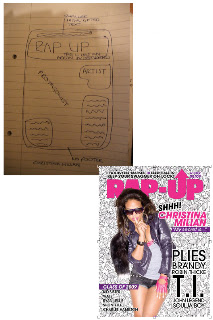
I then decided to start some flat packs so that we can see some appropriate layouts before starting the project. I felt that this helped because I was able to look at the different dimensions as well as think ahead to colour schemes and cover artists.
These Flat Packs drawn shows the different layout and examples of existing Hip Hop magazines layout would help me attract my Target Audience more successfully.
 |
| My second contents page |
 |
| My first contents poage |
 |
| M front cover (ORIGINAL) |
 |
| XXL example flat pack |
 |
| Rap Up example flat pack |
I also appealed the the ghetto nature by the pose my protagonist did
 |
| My pose enhances the readers curiosity |
 |
| XXL magazine does the same, mainly injecting fear through the angry look and fingers leading to it. |
Friday 9 March 2012
Double Page Spread Construction
THE Construction
Firstly I obtained an image of my protagonists in a particular position, touching the wall.I decided to play off this position as it gave me an opportunity to add things that weren't necessarily there. That is what gave me the idea for giving her a background of posters of former and currant Hip Hop artists.

Firstly I replicated the page and started place images of the artists and compress them to make a collage. This was done by creating new layers and compressing the image to create a background layer without affecting the quality of the picture.
This turned out very successful as it gave me a bold edge to work with I wouldn't have to add any other designs to the image.The addition of pop colour provided by the cover of the XXL magazine allowed me to synchronize with the red when I wanted to use this as the quotes and title colour. I then used the untouched original image and used a large eraser tool to create a fading effect as well as fading the edges and then it the faded picture over the collage the create her presence as well as her being in the beige background.
This turned out incredibly successful and the effect went according to plan, it also allowed me to show a convention of a hip hop magazine by having similar and legendary artists which the new artists to look up to.
I then went on to create the second half of my page. This mainly consisted of the text as I already had an image dominated page. I firstly put the interview text into three columns; making the questions and answers identifiable by the boldness and type of font.
Types of font used:

I went into photo shop and used the patch tool to get rid of the wispy hair in the way of her face and the baby hairs that looked out of place. I then used to copy tool to make sure that the skin was clear all over before used the brightness/contrast tool and bring her skin to life as well as fit in with the quality of the images used during my final product.
I then decided to crop my image so that we could fit in the the double page but then when putting in In-design, the image came out shorter than what I needed.
I then added another layer, creating a quote by changing the colour of the text and adding a different font. This was carried through as it was used for the title of the artist and the introduction strap line. I then added yet another layer as I wanted to figure out a way to put a larger letter rather than the original increased font size. So I decided to add a thick big letter A for along and add editing. Firstly I had to Aline the letter with the whole page so that the A would be an even size.
It was then followed by adding the transparency tool and applying it to the letter, further I added it to the back so that there was no chance that text would be left behind. This effect is used as a convention in music magazines but usually as a block colour. I feel that I have successfully reinforced and challenged the stereotypes of a hip hop magazine.
All that was left of my music magazine was to figure out the fonts colour scheme that would go well with the other pages such as the front cover and the double contents page. Firstly I tried the mint green that has a place in the contents page. I felt that this went well with the image but it failed to stand out on the white background. I then tried to make a colour scheme of this by adding the fuchsia pink coverline with a black strap line but it failed to come together.
 I felt that maybe I should try to link the colour scheme to existing colours on the page such as the red seen in the corner saying XXL. This then didn't work as it clashed with other parts of the page.
 This was my final colour scheme was when I went back to the beginning and look over the colour scheme. I eventually choose fuchsia pink, golden yellow and all the colours used in the original word remix on the contents.
My final edit consisted of this after the background image change.
I added the different colour such as the mint green that existed in the front cover and contents page as well as adding a masthead, conventionally seen in most music magazine.

The Construction Of My DPS Page
To begin my DPS page i had to make sure that I had an image that was very bold and said a statement about my artists music.
Firstly I obtained an image of my protagonists in a particular position, touching the wall.I decided to play off this position as it gave me an opportunity to add things that weren't necessarily there. That is what gave me the idea for giving her a background of posters of former and currant Hip Hop artists.
Firstly I replicated the page and started place images of the artists and compress them to make a collage. This was done by creating new layers and compressing the image to create a background layer without affecting the quality of the picture.
This turned out very successful as it gave me a bold edge to work with I wouldn't have to add any other designs to the image.The addition of pop colour provided by the cover of the XXL magazine allowed me to synchronize with the red when I wanted to use this as the quotes and title colour. I then used the untouched original image and used a large eraser tool to create a fading effect as well as fading the edges and then it the faded picture over the collage the create her presence as well as her being in the beige background.
This turned out incredibly successful and the effect went according to plan, it also allowed me to show a convention of a hip hop magazine by having similar and legendary artists which the new artists to look up to.
I then went on to create the second half of my page. This mainly consisted of the text as I already had an image dominated page. I firstly put the interview text into three columns; making the questions and answers identifiable by the boldness and type of font.
Types of font used:
- Cartoonist SF
- Arial

I went into photo shop and used the patch tool to get rid of the wispy hair in the way of her face and the baby hairs that looked out of place. I then used to copy tool to make sure that the skin was clear all over before used the brightness/contrast tool and bring her skin to life as well as fit in with the quality of the images used during my final product.
I then decided to crop my image so that we could fit in the the double page but then when putting in In-design, the image came out shorter than what I needed.
I then added another layer, creating a quote by changing the colour of the text and adding a different font. This was carried through as it was used for the title of the artist and the introduction strap line. I then added yet another layer as I wanted to figure out a way to put a larger letter rather than the original increased font size. So I decided to add a thick big letter A for along and add editing. Firstly I had to Aline the letter with the whole page so that the A would be an even size.It was then followed by adding the transparency tool and applying it to the letter, further I added it to the back so that there was no chance that text would be left behind. This effect is used as a convention in music magazines but usually as a block colour. I feel that I have successfully reinforced and challenged the stereotypes of a hip hop magazine.
All that was left of my music magazine was to figure out the fonts colour scheme that would go well with the other pages such as the front cover and the double contents page. Firstly I tried the mint green that has a place in the contents page. I felt that this went well with the image but it failed to stand out on the white background. I then tried to make a colour scheme of this by adding the fuchsia pink coverline with a black strap line but it failed to come together.
I added the different colour such as the mint green that existed in the front cover and contents page as well as adding a masthead, conventionally seen in most music magazine.
Subscribe to:
Posts (Atom)