EVaLUaTIoN Question 1:
Music magazines often have many conventions that set them apart from the different magazines such as lifestyle magazines or similar niche magazines such as gardening magazines.
Conventions such as cover lines, bold statements and colour schemes are important to show as a music magazine.
I made sure that I wanted to capture as I was making a own so that the magazine would be successful in the title, font, layout, house style and even the type of people that would be ideal to put on a music magazine.
The title
The conventions of music magazine title are supposedly different compared to the genre of the music. For example Q magazine would have a more neutral title as it covers a large amount of music genres withing the magazines however vibe magazines would not has a niche market, allowing its main priority to be the stereotypical target audience to focus on. Hip Hop magazines usually have all the conventions which is commonly and publicly shown through the music, their outer appearance and their stereotypical attitude. This is often perceived as the gangsta attitude that all magazines should have if they wanted to follow the conventional way in which the magazine is correctly following the genre.

 In most hip hop magazines the title is bold and stands out from the page, showing the tougher side reflected thought the music and the stereotypical gangsta reputation. these can also be put into blocks to clash with the page or have a harsh tone to the colour scheme that may be set for that issue. The niche magazines also have the font to be very edgy;capturing the essence of the magazine being for hip hop alone showing commitment. In addition popular hip hop magazines contain titles that usually are a statement to the industry or a common phrase.
I used all these conventions to create a title which contain a sharp statement along with using bold colours. I made that the scheme still worked and that kept to the conventions of a hip hop magazine. I also had the plug put in place, conventionally put in other magazines but to stand out from competition I embedded it into the title.
CHANGE IT UP!
The date has also been added in similarly to the plug and I have given them their own colour scheme but stuck to monochrome.

The language used in a magazine is an important part of the magazine as the readers often expect different language to be spoken within the genre. Conventionally a hip hop magazine would contain slang and profanities to correspond with the erratic behaviour and gangsta lifestyle shown stereotypically and is commonly used in all media areas. Hip Hop magazines often refer to the hard edge and make the niche audience feel more comfortable when they feel like the magazine knows what they're talking about rather than making judgements and relying on what mainstream music feel about the hip hop industry.
On my cover I chose to have a coverline which uses a profanity but decide that the magazine would not contain a huge amount due to targeting a more female hip hop lover rather than using a convention for a male hip hop magazine such as XXL. The line
Its Sabrina BITCH!was supposed to show the attitude of the artist without making her seem too vulgar, which is often a mistake mainstream music magazines contain when trying to capture conventional behaviour I have also indicated this by highlighting this in a different font.
The fonts and texts of a magazine give a sense of identity to the magazine and a used conventionally in all types of magazine whether it was lifestyle or music.
Conventions of fonts and texts are fairly simple as most magazine require a house style and colour schemes. This helps the magazines to sort out the the different departments in the magazines as well as showing the more important articles such as feature to the stories.
 In hip hop magazine it is conventional for the font to be bold, capturing the stereotypical rough appearance. Graffiti is extremely popular with hip hop I did experiment with http://www.dafont.co.uk/ but was unsuccessful in finding a font that had a clear, crisp graffiti font with a famine touch, to match my target audience of this particular issue.
 |
| This image shows the comparison between the Internet found font and the font found within photoshop. |
In hip hop magazine it is conventional for the font to be bold, capturing the stereotypical rough appearance. Graffiti is extremely popular with hip hop I did experiment with http://www.dafont.co.uk/ but was unsuccessful in finding a font that had a clear, crisp graffiti font with a famine touch, to match my target audience of this particular issue.
Layout and structure
 The layout and structure is conventionally based around the centre of the picture. The protagonist is often seen clear with no text in the centre other than when there is a cover line nearer the bottom of the page.
Hip Hop magazines often have less info and have the cover line along with just a compact artists index. This is to intice the viewer into focusing in the protagonist as well as leaving it for the contents.
I have decided to take this approach with almost having the a border of text around the centre of the background image without breaking the convention of having less information on the cover of a music magazine than on a lifestyle.
 |
| We love POP magazine shows an example of the clear middle and text around the sides. However it does have more text that can relate more to lifestyle. |
Types Colour Schemes
Conventionally in music magazines the colour scheme often change by the issue unlike the lifestyle magazine which is seasonal, and usually have a link to the artist that dons the cover. popular colour schemes such as primary colours and black connotes the aggressiveness that hip hop music magazine stereotypically have. Monochrome is also a popular colour scheme as it can show simplicity yet class which is often used to introduce a protagonist who may have high status.
Most magazines follow the BMYB code which consists of colours that determine any colour that may be printed.these are always shown, this has added to my decision to have a shade of magenta in my cover.
Most magazines follow the BMYB code which consists of colours that determine any colour that may be printed.these are always shown, this has added to my decision to have a shade of magenta in my cover.
Because of my protagonist I have more famine colours such as fuchsia and burnt orange but are bright and bold to ensure connotation.
Types of music
The type of music is vital to be taken seriously if you want to create the successful music magazine.
in hip hop magazines the music is strictly hip hop. This conventionally allows the niche market to trust the magazine to bring the best in their music rather than becoming a more mass market magazine like Q magazine.
An example of hip hop music I would be advertising for my target audience.

The Composition Of The Front CoverThe type of music is vital to be taken seriously if you want to create the successful music magazine.
in hip hop magazines the music is strictly hip hop. This conventionally allows the niche market to trust the magazine to bring the best in their music rather than becoming a more mass market magazine like Q magazine.
An example of hip hop music I would be advertising for my target audience.
 The composition of a front cover has many conventions and without them would make the magazine less realistic and would not attract the readers but look like a poster. A front cover usually has a mid close up of an artist protagonist looking directly into the camera. This allows the reader to be drawn to the magazine;mentally being pulled into the artist's eyes. This is followed by the title; typically at the top of the page in big font size so that the reader can automatically identify the magazine. The text on the cover is usually away from the centre of the page, making a clear space for the image to be seen. Conventionally the look of the artist is important as this determines whether the reader buys the magazine.
The image on the right shows how the composition can affect the way a magazine looks and how it fits the conventions of a music magazine.

 |
| The bumper sticker was also a stereotypical addition to the front cover. I decided to use this to advertise for a demanding artists concert. This connotes the reader to think that the magazine gives opportunities. |
Within my front cover I have decided to follow most of the layout conventions like the image, outer text and masthead however I attempted to challenge this by enlarging two texts into the picture; popularly indicating which were more important.
Moreover I added the coverline lower than usual followed by the strapline being left lined but compact.
The model
 The model is very important I needed to get the right look for my music magazine, focusing on the the perfect pose which would show the sterotypical look that is found in a female rapper. Her eyes are highlighted with her eyeliner, making them seem darker and more mysterious. We also had decided to use an eyelash curler to achieve the perfect 'stare'. Adding the bronzer helped her skin gain more shadow but deliver clearer skin. I tried to colour coordinate her nail varnish with the house style. However the best way to create a better front cover was to make the two shades to orange clash. The position of her hands were to add originality and to draw the reader towards her eyes. futhermore the positions was used as imagery for a camera or a lense of some sort. This later corrosponded to the play on words used in the strapline "shes finally let us see through the keyhole" the play on words are also convention of music magazines, but less common setting mine apart.
The image below is a prefect example into how the position of the protagonists hands and eyes can incise the viewer into looking at him.

So hows does mine compare from a REAL front cover?


 |
| the image shows the compositon of the centre of my front cover. |

The contents
As you can see I decided to have a double contents page like fellow Hip Hop music magazines, VIBE.
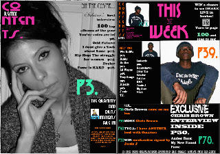 |
| In my contents I decided to have two pages to make sure that all the information was properly displayed and that nothing was forgotten. I also wanted to use and challenge conventions with my own. I used techniques with my preliminary by repeating the title of my contents on the top left hand side of the 'B Side' of my contents. I later turned to use the conventional saying of "THIS WEEK"To introduce information without using too mush space, which contents would have. |

 For the first page I decided to use a single image as the background for my contents but removed the colour. This was to make sure that it fitted well with the second page which was black as well as go with the colour scheme used for the front page.
 I decided to use this and use some colour and highlight the page number for my Double Page Spread.
I also used to the way they displayed contents because I thought that it was something fresh and new.
 |
| Shows the first page of a double contents |
 |
| shows the second page |