Friday, 9 March 2012

Contents page construction

My Contents Pages Constructions
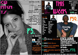
My contents was eventually the hardest part of my final pieces as it took lots of different ideas to be put together to let the contents fit in with the house style and still look organized as a conventional contents page. I also had to have two contents pages as they 

My first idea was to make the background colour Grey so that it could allow the colours black and white, which are both part of my colour scheme. But when it came to adding the different texts it different come out clear and looked slightly cheap. Firstly I decided to clear up the pictures by adding brightness to them, making them look more professional.
The brightness tool was also to add colour to the dull looking background. The contrast was not used as much as it was for the front cover image because i needed them to be crisp and without the highlight pigments on their skin. I then used two images to create a box to put subscription information in.
The lineament was where i wanted to look different but in the end just looked boring and didn't fit in with my colour pop house style.  
As you can see i didn't get very far with the first idea as I could see
 that it wasn't going to be successful. The problems were mainly
occurred when the house couldn't be used a well was it was in the front cover
and the background colour became odd because of the colour of the texts and images.

After the first idea didn't work as well as i wanted i decided to make a new contents from scratch.
I started with new background colour to a lighter Grey so I could have a larger variety of colours.
Firstly I decided to add the same pictures, leaving them edited but them cropped the main image so that it would have a more landscape approach. I then added a new layer so that I could create an elliptical rectangle which later tilted, This was to make a bold page marker on my contents and add a conventional contents page feature. This was later was joined by another piece of text, which was a quote highlighting a bold statement made by the protagonist which the reader would find inside the feature.
"I'm grateful for what I've got, but I knew I would get it"
 Following this I decided to add the text at either side which would create two smaller columns to the largest column in the middle which would be used for the images such as the main image of my second protagonist.
For my text I decided to use font that would make certain highlighted areas known as well as sticking to the house style used on the front cover and the first contents page.
I then added some more layer and more elliptical rectangle that are tinted black, these are used to make the structure lines which are conventionally used in common music magazines. However this made my work look sloppy and unkempt so I decide later to reduce the size.
The feature of the album I created was made through layers of text onto the smaller cropped image and was tilted clockwise to create a realism. This was later added before making a separate J Peg image and adding it on the contents.
The REMIX magazine logo was used by having different colours for each letter in the font. The logo was also used to make the contents sign which was split up into groups for three lines. Remix was placed in between two of the line was to create a structural design which contributed to the identity of my product. 
This cover too was unsuccessful as it didn't look professional at all and it stood out  for all the wrong reason such as being too different from the house style.  

As the second design didn't turn out so well I decided to make a third attempt by adding more layer which had the rectangular shapes but in black and were enlarged to make a bolder platform for the text. I then added different text such as the "And the Grammy & Brit nomination are in!". The colour scheme was becoming more important as I had to fit the house style as well as maintaining a level of professionalism and displaying the conventions of a typical music magazine contents page.
Using the monochrome text and its contrasting background allowed us to bring the hip edge to the page but the Grey original background often clashed with the colours.The added images such as the Grammy award and the Brit were added using layers but these were too fake and disbelieving.
The third design didn't show much progress from the second and I felt like I needed to start from scratch if I was to get the successful contents page.
This is an image of a typical scan code,
placed on the far top right of the page.


Then came up with the common idea of adding the scanner which allowed people to interact with their magazine as well as bringing in the latest technology such as scanning with the iPod and iPhone.
These scans can give the readers insight into the magazines and the interaction that they might not get, even on the website. So I decided to use on my contents by adding synergy between the offer on the drake tickets with the scanning opportunity provided. This also allowed me to add a very modern convention of music magazine and showing the link to technology and the stereotypes of a Hip Hop music magazine. 


My final contents page turned out well due to the adjustment made from a new start.
First I started by getting rid of the old Grey background and getting a darker Grey colour which allowed me to do what I wanted with the monochrome and block, bright colours as well as give it the professional polish.
 I then added the extra layers and the elliptical rectangles to create the boxes, which were larger in contrast to the previous attempts. this allowed me to have more space to work with and having less room to contrast colours with both the text and the background.
The colour scheme came directly from the
front page and was used as a
 beacon by the dark colours. These colours were the fuchsia,
 lime sea foam green and burnt orange.
This is my FINAL edit.
This was followed by the texts in big and bold "This Week". This was a general convention shown in popular music magazines such as Q. I then decided to get rid of the broken down contents page title and put it in vertically and repeated. I thought that this would make great reference to my preliminary task as I used that technique for both the the title and contents.
The joint offer on Drake was then placed beside it to create three columns that may or may not be used.
The largest image was given its own background layer rectangle and took two of the three columns but later shortened to create room. I kept the image developed as it was but I got rid of the extra layer and box shape that it created for a neater, bolder page number, which jumped from the page. Another example of this is where I used the same technique for the page number of the Amber Rose story.
The artists index was given a smaller space besides the main image and a small but intense image.
I then used celebrity endorsement, often a convention of music magazines to create a album rating on the contents.
 In the first contents page I started by desaturating the image so that I could add the pop colour scheme. This was done by the brightness and saturation.
I then added the text by creting dfferent layers and synchornising the colours ith the previous page.
I then added an elliptical rectangle to join the house style of the previous page and added text, which on previous efforts I put on one page.
I think spreading it out over two pages was the best thing as I could out all designs forward without it looking rushed are less professional.
The fonts I used were:
CHI Town NF
Cooper Std
Base 02
Drive Thu NF

Thursday, 8 March 2012

EVALUATION Question 4: Who would be your audience for your media product?

EVaLUaTIoN 4

My Target audience is strictly hip hop and Rn B lovers aged between 16-30.


However I wanted the magazine to be more female based because of the lack of attention female rappers and similar artists get on male hip hop magazines such as XXL and VIBE magazine.

I have previously go on to talk about my target audience and go into depth on the original hip hop and its evaluation to to the current hip hop we know today.
my blog link to my...
My target audience


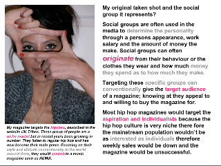
This out of shoot photo shows the target audience in her nature.
the following images clearly display my stereotypical target audience for a female member.
Sabrina Carroll was the model I used as my main protagonist for my magazine as she had the look I was looking for.  

She is also a student so she shows the care and responsibility free side of a reader and would be more likely to commit to a magazine such as REMIX.

This graph displays the type of music that would be used by my target audience, categorized by UKTribes; the Hipsters.
They originated in the heart of East London as well as in Harlem, New York. This style has since spread all across the world.
It shows that we enjoy fashion labels that have a ghetto quirkiness and they like to be original.Once something has become mainstream, it is quickly dumped.
They were once called Nathan Barley's, after the nature of a character from a 1980s comedy.


However this graph shows another group that would be included and would be the majority of my target audience, categorized by UKTribes: Get Paid Crew.

They originated from the ghetto areas such a New york and Philadelphia and has now spread to south east London.

It shows you enjoy fashion labels and your proud to show it, for example you leave the sticker on to show a hat new as well as have new white trainers.You want to have an empire in something and would consider yourself as someone always on the ball.


This Video shows how UKTribes have detected Hipsters and Get Paid Crew
Click Here
This is an image of a group of my target audience shows their reaction to the way they see my magazine.


Monday, 5 March 2012

EVALUATION 3: What kind of media institution might distribute your product and why?

EVaLUaTIoN 3:

The magazine industry has grown to be extreme and there are both weekly and monthly battles to produce a biggest selling magazine. For a magazine to be targeted accurately and to be distributed to the target audience the magazine has to be sold through an experienced but suited publisher.
 Music magazines are usually sold under the same publisher as lifestyle and other niche audience magazines so that the company is shown to have diversity, however publisher do not attend to have too many as this could deter from conventions of one magazine and put too much in another.

For my music magazine I have considered two publishers:

IPC media

IPC MEDIA is one of the nations top magazines publishing household names such as NUTS and NME.
 IPC Media produces more than 60 different brands, with print reaching almost two thirds of UK women and 42% of UK, a huge total of 26 million, while their websites gain overall 20 million users every month.

The inspire is popularly a male division; selling magazine magazine that would appeal to men in both mass and niche markets. most of their magazine have a male centred focus and may not be the best for my magazine however this may give me the right gap in the publisher for the magazine to have its own conventions and would be solely focused on.
Woman's magazines in IPC Connect are all lifestyle and local fashion. their female impute to their company shows the stereotypical impute of a female and doesn't seem to challenge the conventions in any way.
This might be a hindrance to REMIX because they might not see the vision for the magazine as making an impact to the female niche audience allow the magazine to show hip hop to its niche market and might turn the magazine mainstream in time.


IPC Media already publish two well known music magazines; NME and UNCUT.
NME is the most popular magazine for IPC media to publish. NME is a weekly magazine and the title stands for New Musical Express. this already introduces the type of music that may be introduced in the magazine. It may also be an indicator of the audience they want to attract; young people.


Bauer media

Bauer media is another international magazine publisher, producing magazines such as GRAZIA, heat and more! as well as music and film magazines such as Kerraing!, Mojo and Empire.

Upon this I have decided to make this my aimed publishers for my music magazine.


Bauer Media is a division of their multinational media group. It is europe’s largest privately owned publishing company. The group is a worldwide empire offering over 300 magazines in 15 countries, as well as online, TV and radio stations.

Bauer media is also popularly a male division; selling  major male magazines such as FHM and Q that would appeal to men in both mass and niche markets.

Bauer media attracts a 75% male to 25% female population (the male domination is through the increase in number in magazines moreover the late development of female targeted magazines). Most of their magazine have a male centred focus and may be the best for my magazine because it allows my target audience to be untouched and give me the right gap in the publishing company for the magazine to have its own conventions and would be solely focused on.


Woman's magazines in Bauer are mostly lifestyle but do contain popular high fashion magazines. Their female input to their company shows the stereotypical input of a female through their behaviour and even choice of music doesn't seem to challenge the conventions in any way.

This is perfect for REMIX magazine as it allows various magazines to collaborate with my music magazine with many benefits.firstly it would allow my magazine to be amalgamated with other female that may attract both mass and niche markets.

Both mass and niche market to the magazine through offers of free concert tickets and a discount on a fashion statement piece. Bauer owns more! and GRAZIA which would give REMIX a platform to break in to their target audience. Furthermore it would incorporate their individuality through breaking the stereotypical type of music that women listen to.

Synergy can also be created through the to media products of my magazine and the music radio channel. this would give me an opportunity to use many endorsement deals into their show and celebrity protagonists for further front covers for REMIX magazine.

as well as the fashion they peruse, we could
amalgamate together to create deal which would
improve the way people would see both magazines
as well as widen to mass market.


This would be perfect for REMIX because they might see the vision for the magazine within other music magazines such as Mojo and Kerrang! as making an impact to the female niche audience allow the magazine to show hip hop to its niche market. This would flourish because of its individuality, which can juxtapose to the many forms of media and the wide mass and niche market which my magazine could appeal to both.
click to see kerrang's niche website as to NME'S
mainstream one, targeted for the mass market


As you can see, my magazine among others fits well and looks as professional. It would also fit with Bauer media as many  examples of synergy can be used between REMIX and KISS radio.

Thursday, 1 March 2012

EVALUATION 2:How does your media product represent particular social groups?

EVaLUaTIoN Question 2

I have decided to use more media terms for Question 2 like photo shop, You tube and PowerPoint in order to break down the different ways in which my front cover and contents fit the conventions of a stereotypical hip hop music magazine.

 Most groups are often known by the modern society and we now try to identify themclick here
My work against PAPER magazine.

Posture
A XXL example of posture and gesture. As you can see the rapper THE GAME is very body confident and strikes a pose directing to the eyes.


angle and shot type
An example by VIBE magazine of angle and shot type as well as lighting. the lighting is directed straight at his face to create more authority through the contrast on his face.


The paper magazine:

The PAPER magazine that I have used for comparison shows that I have used both the conventions of a hip hop music magazine through the processes needed to achieve an appropriate picture for my front cover.
The magzine shows a mid shot image of nicki minaj, against a clear white background.
She is seen making a gesture by holding her hair while her hand is in the clenched position. This can donnote wealth and power and her strong adjustment into fame. This is the intention I want to give to my readers when they see my front cover.
the text is clear around her , making her the centre of attention and adding to her sense of importance.

Tuesday, 28 February 2012

EVALUATION 1: In what ways does your magazine use, develop or challenge forms and conventions of real media forms.

EVaLUaTIoN Question 1:
Music magazines often have many conventions that set them apart from the different magazines such as lifestyle magazines or similar niche magazines such as gardening magazines.
Conventions such as cover lines, bold statements and colour schemes are important to show as a music magazine.
I made sure that I wanted to capture as I was making a own so that the magazine would be successful in the title, font, layout, house style and even the type of people that would be ideal to put on a music magazine.

The title
The conventions of music magazine title are supposedly different compared to the genre of the music. For example Q magazine would have a more neutral title as it covers a large amount of music genres withing the magazines however vibe magazines would not has a niche market, allowing its main priority to be the stereotypical target audience to focus on. Hip Hop magazines usually have all the conventions which is commonly and publicly shown through the music, their outer appearance and their stereotypical attitude. This is often perceived as the gangsta attitude that all magazines should have if they wanted to follow the conventional way in which the magazine is correctly following the genre.
In most hip hop magazines the title is bold and stands out from the page, showing the tougher side reflected thought the music and the stereotypical gangsta reputation. these can also be put into blocks to clash with the page or have a harsh tone to the colour scheme that may be set for that issue. The niche magazines also have the font to be very edgy;capturing the essence of the magazine being for hip hop alone showing commitment. In addition popular hip hop magazines contain titles that usually are a statement to the industry or a common phrase.
 I used all these conventions to create a title which contain a sharp statement along with using bold colours. I made that the scheme still worked and that kept to the conventions of a hip hop magazine. I also had the plug put in place, conventionally put in other magazines but to stand out from competition I embedded it into the title.
CHANGE IT UP!
The date has also been added in similarly to the plug and I have given them their own colour scheme but stuck to monochrome. 


 The language used
The language used in a magazine is an important part of the magazine as the readers often expect different language to be spoken within the genre. Conventionally a hip hop magazine would contain slang and profanities to correspond with the erratic behaviour and gangsta lifestyle shown stereotypically and is commonly used in all media areas. Hip Hop magazines often refer to the hard edge and make the niche audience feel more comfortable when they feel like the magazine knows what they're talking about rather than making judgements and relying on what mainstream music feel about the hip hop industry.
On my cover I chose to have a coverline which uses a profanity but decide that the magazine would not contain a huge amount due to targeting a more female hip hop lover rather than using a convention for a male hip hop magazine such as XXL. The line
Its Sabrina BITCH!
was supposed to show the attitude of the artist without making her seem too vulgar, which is often a mistake mainstream music magazines contain when trying to capture conventional behaviour I have also indicated this by highlighting this in a different font.

Fonts and texts
The fonts and texts of a magazine give a sense of identity to the magazine and a used conventionally in all types of magazine whether it was lifestyle or music.
Conventions of fonts and texts are fairly simple as most magazine require a house style and colour schemes. This helps the magazines to sort out the the different departments in the magazines as well as showing the more important articles such as feature to the stories.

This image shows the
comparison between the
Internet found font
and the font found within
photoshop.

In hip hop magazine it is conventional for the font to be bold, capturing the stereotypical rough appearance. Graffiti is extremely popular with hip hop I did experiment with http://www.dafont.co.uk/ but was unsuccessful in finding a font that had a clear, crisp graffiti font with a famine touch, to match my target audience of this particular issue.


Layout and structure

The layout and structure is conventionally based around the centre of the picture. The protagonist is often seen clear with no text in the centre other than when there is a cover line nearer the bottom of the page.
Hip Hop magazines often have less info and have the cover line along with just a compact artists index. This is to intice the viewer into focusing in the protagonist as well as leaving it for the contents.
I have decided to take this approach with almost having the a border of text around the centre of the background image without breaking the convention of having less information on the cover of a music magazine than on a lifestyle. 
We love POP magazine shows
an example of the clear
middle and text around the sides.
However it does have more text that
can relate more to lifestyle.


Types Colour Schemes

Conventionally in music magazines the colour scheme often change by the issue unlike the lifestyle magazine which is seasonal, and usually have a link to the artist that dons the cover. popular colour schemes such as primary colours and black connotes the aggressiveness that hip hop music magazine stereotypically have. Monochrome is also a popular colour scheme as it can show simplicity yet class which is often used to introduce a protagonist who may have high status.
Most magazines follow the BMYB code which consists of colours that determine any colour that may be printed.these are always shown, this has added to my decision to have a shade of magenta in my cover. 
Because of my protagonist I have more famine colours such as fuchsia and burnt orange but are bright and bold to ensure connotation.

Types of music

The type of music is vital to be taken seriously if you want to create the successful music magazine.
in hip hop magazines the music is strictly hip hop. This conventionally allows the niche market to trust the magazine to bring the best in their music rather than becoming a more mass market magazine like Q magazine.
An example of hip hop music I would be advertising for my target audience.

The Composition Of The Front Cover

The composition of a front cover has many conventions and without them would make the magazine less realistic and would not attract the readers but look like a poster. A front cover usually has a mid close up of an artist protagonist looking directly into the camera. This allows the reader to be drawn to the magazine;mentally being pulled into the artist's eyes. This is followed by the title; typically at the top of the page in big font size so that the reader can automatically identify the magazine. The text on the cover is usually away from the centre of the page, making a clear space for the image to be seen. Conventionally the look of the artist is important as this determines whether the reader buys the magazine.

The image on the right shows how the composition can affect the way a magazine looks and how it fits the conventions of a music magazine.


The bumper sticker was also a stereotypical
addition to the front cover. I decided to use
this to advertise for a demanding artists concert.
This connotes the reader to think that the
magazine gives opportunities.

Within my front cover I have decided to follow most of the layout conventions like the image, outer text and masthead however I attempted to challenge this by enlarging two texts into the picture; popularly indicating which were more important.
Moreover I added the coverline lower than usual followed by the strapline being left lined but compact.


The model

The model is very important I needed to get the right look for my music magazine, focusing on the the perfect pose which would show the sterotypical look that is found in a female rapper. Her eyes are highlighted with her eyeliner, making them seem darker and more mysterious. We also had decided  to use an eyelash curler to achieve the perfect 'stare'. Adding the bronzer helped her skin gain more shadow but deliver clearer skin. I tried to colour coordinate her nail varnish with the house style. However the best way to create a better front cover was to make the two shades to orange clash. The position of  her hands were to add originality and to draw the reader towards her eyes. futhermore the positions was used as imagery for a camera or a lense of some sort. This later corrosponded to the play on words used in the strapline "shes finally let us see through the keyhole" the play on words are also convention of music magazines, but less common setting mine apart.
The image below is a prefect example into how the position of the protagonists hands and eyes can incise the viewer into looking at him. 


So hows does mine compare from a REAL front cover?


the image shows the compositon
of the centre of my front cover.


The contents
As you can see I decided to have a double contents page like fellow Hip Hop music magazines, VIBE.
In my contents I decided to have two pages to make sure that all the information was properly displayed and that nothing was forgotten. I also wanted to use and challenge conventions with my own.
I used techniques with my preliminary by repeating the title of my contents on the top left hand side of the 'B Side' of my contents.
 I later turned to use the conventional saying of
"THIS WEEK"
To introduce information without using too mush space, which contents would have.
For the first page I decided to use a single image as the background for my contents but removed the colour. This was to make sure that it fitted well with the second page which was black as well as go with the colour scheme used for the front page. 
 VIBE magazine is an example of this by creating 'A Side' and 'B Side' to their contents as well as having the single picture.
I decided to use this and use some colour and highlight the page number for my Double Page Spread.
I also used to the way they displayed contents because I thought that it was something fresh and new.
Shows the first page of a double contents

shows the second page


Thursday, 9 February 2012

Interview For Sabrina DPS

How does it feel to have the spotlight on you?

its about time really, for the past five years Ive been waitin and waitin for the time to release my music. and looking at all the shit Ive been through i deserve it.
her eyes are still closed and calm as ever, drumming her fingers on the arm rests while still in the cross legged position.

It must get too much though?

no i like the attention, good or bad they're the ones wasting away being hateful, not me.
she shifts
you know sometimes i think those nights i slept on the street or cried myself to sleep weren't enough the praise i get today. don't get me wrong i love my fans but some people are just drifters, probably just brought the album because everyone else is. and of course you get the haters who are first in line to criticize your every movement and every word, as well as the first to watch an interview on you tube and come to every tour. fuckin ironic but funny lets not lie.

Do you feel like the wrong image is portrayed about you?

her eyes bolt open and she sits up straight. her eyes pierce like knives and silence fills the room.
she bursts out laughing, rubbing her hands together with glee
haha course its not. To them im a bitch and i love it its the best thing about my apparent behavior it means i get away with what i want, when i want it. if there was more people with balls like me the industry would need saving in the first place know what i mean. as for smoking, its in my lung not theirs they should get used to it.
she goes back to her original position; calmer with a huge grin on her face.
i know who i am and i don't need the tabloids to tell me
she peeps though one of her eyes with a bold stare
write THAT down

so lets talk music, there's nothing really to describe your sound is there?

course there is its just better when i say it; take Aretha Franklin, remove the glitzy dress and ladylike attitude and throw in a snap back swag. remix her vocals with 90s blues and that's just my voice. my rapping something else leave you to use your imagination for that one.
the corner of her mouth curls to aknowledge her authority of the interview

wow a real individualist then?

what kind of artist would i be if i wasnt; a fake like all the crap thats in the charts. and yes i meant Nicki Minaj.

what going on between you and her? is it as serious as everyone makes it out?

she sits up straight and uncurls her legs and starts to whisper in a cunning voice
listen to me and listen good ok, she is nothing compared to me ; no orginality, no talent no nothing. shes scared because im better and she knows but hey thats the way the hip hop industry goes. she was only warming the seat for her successor, me.